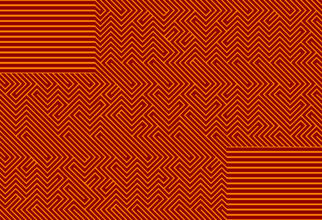
Monday, August 31, 2009

Optica released


Optica

Optica has finally been released. Designed by my friend Manolo Guerrero to pay homage to the op art by colombian artist Omar Rayo. Described as an insane typeface design and awarded by the TDC, this typeface is ideal for titles and recommended for sizes above 100 pt. You can purchase it at My Fonts with a special offer during september.

Optica finalmente ha sido publicada. Diseñada por mi amigo Manolo Guerrero para rendir homenaje al arte óptico del artista colombiano Omar Rayo. Descrita como un diseño de tipografía enfermo y premiada por el TDC, esta tipografía es ideal para grandes títulos, mayores a 100 pt. Pueden adquilirla en My Fonts con un descuento especial durante septiembre.

Cocijotype beta

Cocijotype

This is the lettering I did yesterday for the foundry, the idea had been around me for weeks or months, so, it was easy to draw the letters following my rough sketches. I also would like to tell you that the beta version of the website is running since yesterday, there is still a lot of work to do. As you can see, the word beta is set in the same typeface that the lettering in the previous post.

Esta es la rotulación (lettering o como gusten llamarle) de la fundidora tipográfica, la idea me había estado rondando por semanas o meses, así que fue facil dibujar las letras basándome en mis bocetos burdos. La versión beta de Cocijotype ya está funcionando desde ayer, hay mucha chamba por hacer pero por algo se empieza. La palabra beta es parte de una tipografía que estoy desarrollando, utilizada en la entrada anterior.

Saturday, August 29, 2009

Type for you

A lettering which is becoming a typeface. I did it for a competition at Type for you


Type for you

Sexytype

We are back again, I'm fed up of wordpress, I just don't like it and decided to keep this blog. This is or will be the header of Sexytype, as you can see it has a latin spirit, soft but strong.

Sexytype

Wednesday, August 05, 2009

Barrilito

Cocijotype is proud to introduce Barrilito, a titling typeface based in linoleum & wood engraving with a lot of ligatures and contextual alternates, ideal for impressive titles, or even textures where the the form is more important than readability, something that Gerard Blanchard calls typovision, you can purchase it at MyFonts.

Barrilito