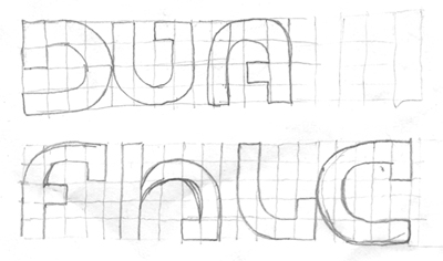
I tried to make reference to buildings and accurate traces and I drew the letters inside a square net, the letters were supposed to be monolinear, but when I saw the result, some parts looked thiner than others, then I remembered something a teacher said to me:
If you want it monolinear, you have to do it non monolinear.I adjusted the thickness and after that I selected Bell Gothic Std for the text below, but I had to make some changes in the I, the Q and the Ñ. This is the result.
2 comments:
Elí…
¿Viste que la misma forma de "D" y "U" te podía funcionar para "A"?
Solo como juego visual :P
Saludos
Sí lo chequé pero no me convenció. Grax por el tip. Abrazo profeta.
Post a Comment