Tuesday, April 13, 2010

Casiopea

Casiopea is a typeface with a pure and geometric design, it has straight and well defined lines. It can be used as a corporate typeface but also in signage systems, it is a little narrow and has a wide aperture to improve legibility. Casiopea has 494 glyphs and six weights: thin, light, regular, semibold, bold and ultra; the ultra weight is free. Casiopea supports the following encondings: Central Europe, Baltic and turkish.
You can buy it at Cocijotype in individuals or the family pack.

Casiopea

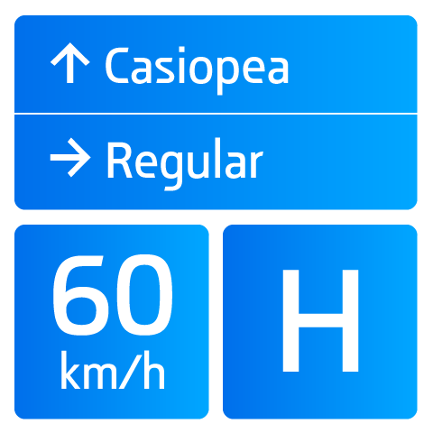
Casiopea es una tipografía cuyo diseño es puro y geométrico, de lineas rectas y bien definidas, es una tipografia corporativa y para señalización, ligeramente condensada, con amplia apertura. Cuenta con 494 glifos y seis estilos: thin, light, regular, semibold, bold y ultra, este último es gratuito, sí ¡gratuito! Tiene soporte para lenguas de Europa Central, Países Bálticos y turco. Cuenta con dos sets de flechas, lo cual facilita el trabajo en señalización.
Casiopea es una tipografía distribuida por Cocijotype en estilos individuales y como familia.

Monday, March 29, 2010

Tipos Latinos 2010

¶ Our work will be featured in Tipos Latinos 2010; Diego Sanz's Quincha is the first and the only (so far) peruvian typeface selected in this Latinamerican Biennial, such a great success for him and for all of us; Manolo Guerrero's Optica received a certificate of excellence, it also was awarded by the TDC and nominated to the Designpreis 2010; Miniblock could not be ignored with its prehispanic touch. Barrilito and its ligatures did a good job and convinced the judges, and last but not least Lucecita Maniac is another work of the 78 selected. This means that all of our commercial work was selected, we are very proud to say this! Cocijotype rocks!

Tipos Latinos 2010

¶ Nuestro trabajo será mostrado en Tipos Latinos 2010; Quincha de Diego Sanz es la primera y la única (hasta ahora) fuente peruana seleccionada en las bienales Tipos Latinos, un gran logro para el y también para nosotros; Optica de Manolo Guerrero recibió constancia de excelencia, lo cual se suma al certificado de excelencia que obtuvo del TDC y la nominación al Designpreis 2010; Miniblock y su toque prehispánico no pasó desapercibida. Barrilito y sus ligaduras tambien convencieron al jurado y finalmente Lucecita Maniac fue uno más de los 78 trabajos seleccionados. Esto significa que todo nuestro trabajo comercial estará exhibido en Tipos Latinos 2010, ¡estamos muy orgullosos de ello! Cocijotype rifa!

Tuesday, November 17, 2009

Quincha


Quincha

This is Quincha, a strong typeface, inspired in the Incan civilization, where every piece fits perfectly with the next. Taking a square as a basis, and counting with 10 stylistic alternates and more than 700 contextual alternates, Quincha offers a wide scope of posibilities for those designers looking for solid texts and with a lasting character. Quincha, first commercial typeface by peruvian designer Diego Sanz Salas, invites us to get into a deep moment inside one of the greatest civilizations of all time. Available at MyFonts.

Esta es Quincha. una tipografía fuerte, inspirada en los muros de la civilización inca, en donde cada pieza encaja a la perfeccion con la siguiente. Teniendo como base el cuadrado, y contando con 10 alternativos estilisticos y mas de 700 alternativos contextuales, Quincha ofrece una amplia gama de posibilidades para quien busca crear textos sólidos y de impresión duradera. Quincha, primera tipografía comercial del disenador peruano Diego Sanz Salas, invita a sumergirnos por un momento en una de las mas grandes civilizaciones de todos los tiempos. Disponible en MyFonts.

Tuesday, November 03, 2009

Lucecita Maniac


Lucecita Maniac

Lucecita Maniac has been released, this is a non kerned version of Lucecita with adjustments in both sidebearings to match the little dots. It is available at MyFonts as a pack which includes the background and the foreground, it has also support for central european languages.
Lucecita Maniac está a la venta en MyFonts, a diferencia de Lucecita Regular, la versión Maniac no tiene kernings y ha sido ajustada en sus espacios de los lados izquierdo y derecho para hacer coincidir las dos versiones que la componen: Foreground y Background. Además, tiene soporte para lenguas de Europa central.

Friday, October 16, 2009

Miniblock


Miniblock

Miniblock is our new type release designed by Manolo Guerrero. This labyrinthic font has an experimental approach, as usual in typefaces of this maniac designer ;) The counters are interesting, specially in the leading because they form complex patterns. You can purchase Miniblock at MyFonts.

Miniblock es la nueva tipografía diseñada por Manolo Guerrero. Esta tipografía de estilo de laberinto tiene un diseño experimental, algo común en las fuentes de este maniac designer ;) Las contraformas son interesantes, en especial en la interlínea porque forman patrones complejos. Puedes adquirir Miniblock en MyFonts.

Tuesday, September 01, 2009

Introducing Lucecita


Lucecita

This is Lucecita, our most recent release based in led screens. It is a funny techno typeface for titles, it can also be used in low resolution screens. You can purchase it at MyFonts with a 50% off during september ;)

Les presento a Lucecita, una tipografía basada en pantalas de leds. Es divertida y tecnológica, pensada para su utilización en títulos, así como en pantallas con baja resolución. Pueden adquirirla en MyFonts con un 50% de descuento durante septiembre ;)

Monday, August 31, 2009

Optica released


Optica

Optica has finally been released. Designed by my friend Manolo Guerrero to pay homage to the op art by colombian artist Omar Rayo. Described as an insane typeface design and awarded by the TDC, this typeface is ideal for titles and recommended for sizes above 100 pt. You can purchase it at My Fonts with a special offer during september.

Optica finalmente ha sido publicada. Diseñada por mi amigo Manolo Guerrero para rendir homenaje al arte óptico del artista colombiano Omar Rayo. Descrita como un diseño de tipografía enfermo y premiada por el TDC, esta tipografía es ideal para grandes títulos, mayores a 100 pt. Pueden adquilirla en My Fonts con un descuento especial durante septiembre.

Cocijotype beta

Cocijotype

This is the lettering I did yesterday for the foundry, the idea had been around me for weeks or months, so, it was easy to draw the letters following my rough sketches. I also would like to tell you that the beta version of the website is running since yesterday, there is still a lot of work to do. As you can see, the word beta is set in the same typeface that the lettering in the previous post.

Esta es la rotulación (lettering o como gusten llamarle) de la fundidora tipográfica, la idea me había estado rondando por semanas o meses, así que fue facil dibujar las letras basándome en mis bocetos burdos. La versión beta de Cocijotype ya está funcionando desde ayer, hay mucha chamba por hacer pero por algo se empieza. La palabra beta es parte de una tipografía que estoy desarrollando, utilizada en la entrada anterior.