Wednesday, December 24, 2008

Happy type holidays!

It's supposed that this blog is about typography, maybe this post is a little out of the topic.
When I knew that the python language existed I began to look for some information about it & found Drawbot an application, developed by Just van Rossum, to begin to learn how to program in python. Looking up for more information I found some excercises from the students fo Type&Media in The Hague and some of them were patterns, sadly that website no longer exists, but I have some examples of the works.

DSC_0253


Well well, but what does a picture of fireworks mean in this blog? When I saw the exercises with Drawbot I inmediatly remembered fireworks because in my city this is a job made by craftsmen & I'm used to see this kind of patterns. I plan to develop in python something like this.
By the way...
Happy holidays!

Friday, December 05, 2008

5 pts

5 pts has arrived, I bought it for the editorial design, look at those margins, they have good space, haven't they?

5 pts inside

The cover is very interesting.

5 pts
5 pts

Type basics are good too:

Designing type is like driving a car. If you drive a car, you always take the curve in a natural way. If you draw a curve of a character on paper, this is exactly the same. The curve starts smoothly, never out of a sudden. While driving a car, you don't start turning the wheel when you are already in the beggining of the curve. A while before you arrive in the curve you anticipate by leading your car gently in the right direction. Think about driving a car when you are sketching type on a paper.

Saturday, November 22, 2008

The stroke, theory of writing


The stroke, cover

For a Mexican like me, it has been quite difficult to get involved in the type world, specially because I come from one of the most marginalized counties from my country. That's why for me is a kind of achievement to have this book in my hands, finally I'm reading this interesting work by Gerrit Noordzij. Set in Ruse from TEFF.
I like the beggining very much:
A letter is two shapes, one light, one dark.

The stroke

Friday, November 21, 2008

Mujer

I did this lettering for a poster about women rights in Jalapa de Díaz, Oaxaca. I took as a reference Burgues Script but I wanted something unique. So I decided to play with curves and obtained this.
Mujer

Wednesday, November 19, 2008

Linotype Ginkgo

Linotype Ginkgo
This is Linotype Gingko, I saw it two weeks ago in the Linotype newsletter & I liked it so much. It has some kind of purity, a generous aperture and a dutch taste, very nice letterforms by Alex Rütten, I feel some self-assure in this typeface, I really liked it, it reminds me Dolly, by Underware.

Friday, November 14, 2008

A brand For Urban & Architectonic Design

Some days ago I decided to design a brand for my workgroup, they are mostly interested in architecture and enginering (I am the exception because I'm a graphic designer), the group's name is Diseño Urbano & Arquitectónico, I had been thinking about this brand for two months, so when I started to sketch the letters it was quite natural to approach to the result.
dua
I tried to make reference to buildings and accurate traces and I drew the letters inside a square net, the letters were supposed to be monolinear, but when I saw the result, some parts looked thiner than others, then I remembered something a teacher said to me:
If you want it monolinear, you have to do it non monolinear.
I adjusted the thickness and after that I selected Bell Gothic Std for the text below, but I had to make some changes in the I, the Q and the Ñ. This is the result.
DUA

Type Design Competition 2009

TDC
For those type lovers & designers who are obsessed with letterforms,the TDC of New York has published the Call for entries for the TDC2 2009, you have until december 19th to send your work. It would be a proud to see more latinoamerican works there, I have seen the work of many good typedesigners from Chili, Argentina, Colombia and Mexico.
One of the judges will be Gabriel Martínez Meave, illustrator, calligrapher & typedesigner from Mexico; another interesting judge will be Jonathan Hoefler, from Hoefler & Frere Jones.
I encourage you to participate & I hope to see many interesting works of the selection. You can download the entry form here.

Wednesday, August 27, 2008

Corbel


This is Corbel, it comes to you for free with Windows Vista. The designer Jeremy Tankard did great work with this typeface, notice the large apeture which makes funtion the typeface perfectly at small sizes, the short ascenders permit a larger x height.
Elzevirian numbers are a special feature. Another interesting things are the italic pararagraph and section glyphs, a real pleasure to view them. As you can see I like the bold italic version.
I would choose this typeface instead of the marvellous Verdana, it has a fresher contemporary look. Finally let me say that you should look at the work of this designer.

Wednesday, August 20, 2008

Change of language

I decided to change the language of my blog because I have a poor response from readers, no more spanish in posts, from now and so it will be written in english. So welcome to the sexytype!

Wednesday, August 06, 2008

Barricada at Sudtipos


Thanks to my friend Ale Paul, now Barricada is available for sale at myFonts as part of Sudtipos collection, it has OpenType features and a lot of flavor!

Saturday, June 07, 2008

Barricada

Seleccionada en Tipos Latinos 2008, Barricada es una tipografía para títulos, llena de sabor, comencé a desarrollarla inspirado en los conflictos sociales que sucedieron en Oaxaca, la voz del pueblo fluía en la radio, la televisión y en las paredes; la gente se sentía cansada de tanto robo e injusticia; entonces pensé en una tipografía sólida para protestar, resistente a granaderos, levantones, policías y gases lacrimógenos. Así fue como surgió, con el paso del tiempo sus formas fueron madurando, haciéndose más particulares y aquel concepto de resistencia quedó solo como un pretexto para diseñarla. Comenzó a lucir más fresca y juvenil, luego le salieron algunos caracteres alternos para no dejar al diseñador limitado en la composición de los títulos. Les presento Barricada.

Friday, June 06, 2008

Tipos Latinos 2008

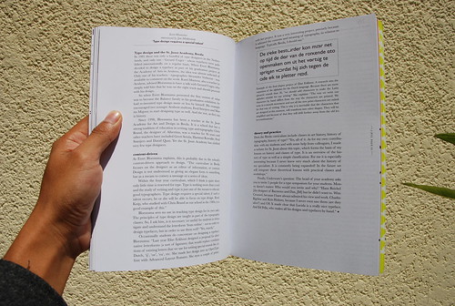
Hace algunas semanas se llevó a cabo la Bienal Latinoamericana de Tipografía Tipos Latinos 2008 en Veracruz,


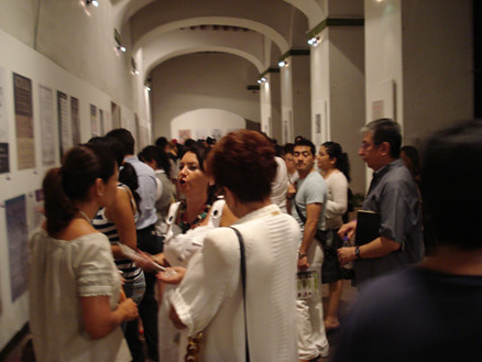
el evento más importante de tipografía a nivel latinoamérica que reúne el trabajo de tipógrafos de la región. En su tercera edición Tipos Latinos fue algo que me dejó una grata experiencia.
Este evento incluyó algunos talleres, un coloquio y conferencias, lo más interesante que pude ver fueron las aportaciones de 
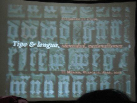
Alejandro Lo Celso en su conferencia Tipografía y lenguaje: identidad y nacionalismos, en la cual nos recordó algunas cosas sobre historia de la tipografía y nos puso algunos ejercicios para diferenciar las Garamond;


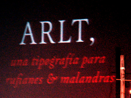
además su presentación de Arlt, una tipografía para rufianes y malandras, me pareció bastante didáctica porque incluyó los personajes representativos de la escuela expresionista, algo que me habría gustado en lo que se extendiera.


Laurette Godinas 
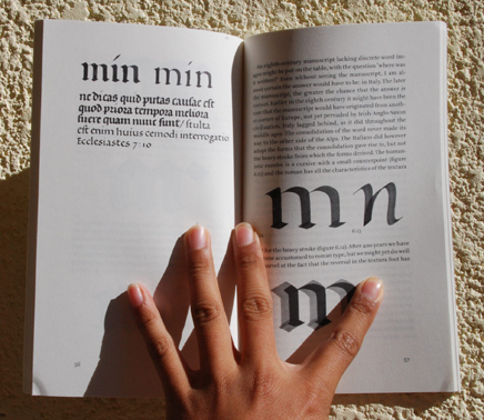
dio una conferencia excepcional titulada Escritura latina: de la capital arcaica a la humanística. Laurette es la primera paleógrafa que conozco.
La conferencia de Ale Paul también me pareció muy interesante, se llamó Educación tecnológica y descubrimiento de la historia, historias de un proyecto. Me impresionó la manera de trabajar tan constante y detallada que tiene.
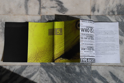
En el coloquio sobre tipografía y educación superior me agradó mucho el proyecto del Interactivo para la educación caligráfica de Isaías Loaiza, un trabajo bastante extenso y lleno de detalles y modelados de los tipos de plumillas.
Pero vayamos a las tipografías de Tipos Latinos, aquellas que me resultaron mejor logradas fueron
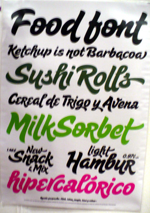
 Burgues y Sugar Pie de Ale Paul, esos trazos se ven bastante espontaneos, hasta parece que fuera muy facil hacer tipografías bien chidas cuando ves su trabajo;
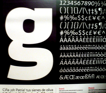

Fondo de Cristobal Henestrosa, una tipografía muy bien resuelta y cuidada; Presidencia de Gabriel Martínez, un sistema tipográfico para la presidencia de la república cuyos caracteres me evocan el espíritu de los códices aztecas;


Amster de Pancho Gálvez, excepcional tipografía para títulos, llena de ideosincracias y un sabor exquisito;
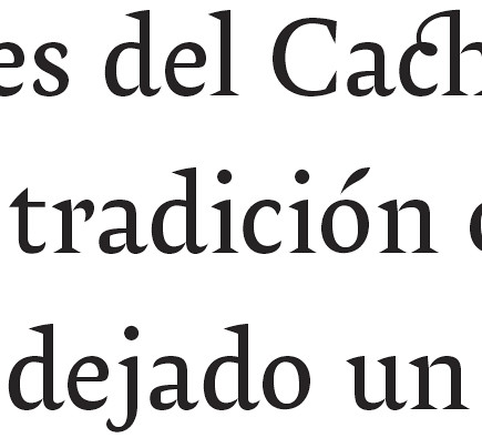

Violeta de Javier Quintana, bastante influenciada por Amster pero muy rica tipografía para texto, Ellis de Gloria Vargas, una tipografía fresca, joven, con caracteres contemporaneos, muy bonita; Kukulkan de Raúl Plancarte, una tipografía para revistas con formas muy originales y
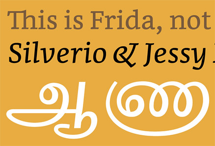
 Frida de Fernando de Mello, un sistema tipográfico que contiene una variante para transcribir el Tamil, desarrollado como proyecto del MATD.


Aunque no pude dedicarles el tiempo que hubiese querido a todas me llevé una gran experiencia y conviví con buenos amigos.

Con Ale
Con Ale Paul

Con Loche
Con Ale Lo Celso


Isaías, Leo, su servilleta y Loche
Isaías, Leo Vazquez, Elí & Loche

Elí y Eréndida
Con Eréndida


René & Silvia

Diseño discográfico

Siempre he soñado con diseñar un disco para Café Tacvba, es un grupo que siempre me ha gustado, tanto por su música como por el diseño de sus discos, bastante experimental. No sé si llegue a ocurrir, pero mientras tanto he diseñado el frente y la vuelta para un disco de Orange Sunshine, grupo de rock holandés, nada de sonidos suaves, esto es rock de verdad, pura batería.
Para ello el estudio Underware convocó a un concurso de diseño y nos proporcionó una edición especial de la preciosa tipografía Fakir, Fakir es una tipografía quebrada contemporánea, llena de desenfado y soluciones muy inteligentes.
Mi pretexto para hacer más divertida la propuesta fue crear el lettering de fakir que contiene algunas formas similares a las de Barricada pero mucho más fluídas. La letra k siempre me parece mas complicada por su traviesa inferior, pues hay que mantener una buena distancia con el asta pero sin que la traviesa abarque mucho espacio horizontal y haga que el caracter luzca extendido. La ligadura con la i fue un detalle que me agradó mucho por la síntesis formal.
Aquí les dejo las imágenes.


Proyecto typomachin

El sexytype continúa, como podrán darse cuenta, pero ahora viene algo muy interesante además, se trata de Typomachin, la primera fundición tipográfica digital oaxaqueña, donde sacaremos trabajo hecho con sabor y pasión. Siempre quise realizar algo diferente en mi lugar de origen, he pensado que tengo todos los elementos necesarios para generar una propuesta auténtica y compartirla con el mundo, entonces decidí crear este proyecto que solo tiene una guía, las letras; dibujarlas, diseñarlas, rotularlas, fotografiarlas, tallarlas, esculpirlas, iluminarlas, grabarlas, proyectarlas; las letras...