Saturday, November 22, 2008

The stroke, theory of writing


The stroke, cover

For a Mexican like me, it has been quite difficult to get involved in the type world, specially because I come from one of the most marginalized counties from my country. That's why for me is a kind of achievement to have this book in my hands, finally I'm reading this interesting work by Gerrit Noordzij. Set in Ruse from TEFF.
I like the beggining very much:
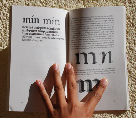
A letter is two shapes, one light, one dark.

The stroke

Friday, November 21, 2008

Mujer

I did this lettering for a poster about women rights in Jalapa de Díaz, Oaxaca. I took as a reference Burgues Script but I wanted something unique. So I decided to play with curves and obtained this.
Mujer

Wednesday, November 19, 2008

Linotype Ginkgo

Linotype Ginkgo
This is Linotype Gingko, I saw it two weeks ago in the Linotype newsletter & I liked it so much. It has some kind of purity, a generous aperture and a dutch taste, very nice letterforms by Alex Rütten, I feel some self-assure in this typeface, I really liked it, it reminds me Dolly, by Underware.

Friday, November 14, 2008

A brand For Urban & Architectonic Design

Some days ago I decided to design a brand for my workgroup, they are mostly interested in architecture and enginering (I am the exception because I'm a graphic designer), the group's name is Diseño Urbano & Arquitectónico, I had been thinking about this brand for two months, so when I started to sketch the letters it was quite natural to approach to the result.
dua
I tried to make reference to buildings and accurate traces and I drew the letters inside a square net, the letters were supposed to be monolinear, but when I saw the result, some parts looked thiner than others, then I remembered something a teacher said to me:
If you want it monolinear, you have to do it non monolinear.
I adjusted the thickness and after that I selected Bell Gothic Std for the text below, but I had to make some changes in the I, the Q and the Ñ. This is the result.
DUA

Type Design Competition 2009

TDC
For those type lovers & designers who are obsessed with letterforms,the TDC of New York has published the Call for entries for the TDC2 2009, you have until december 19th to send your work. It would be a proud to see more latinoamerican works there, I have seen the work of many good typedesigners from Chili, Argentina, Colombia and Mexico.
One of the judges will be Gabriel Martínez Meave, illustrator, calligrapher & typedesigner from Mexico; another interesting judge will be Jonathan Hoefler, from Hoefler & Frere Jones.
I encourage you to participate & I hope to see many interesting works of the selection. You can download the entry form here.